Dashboard
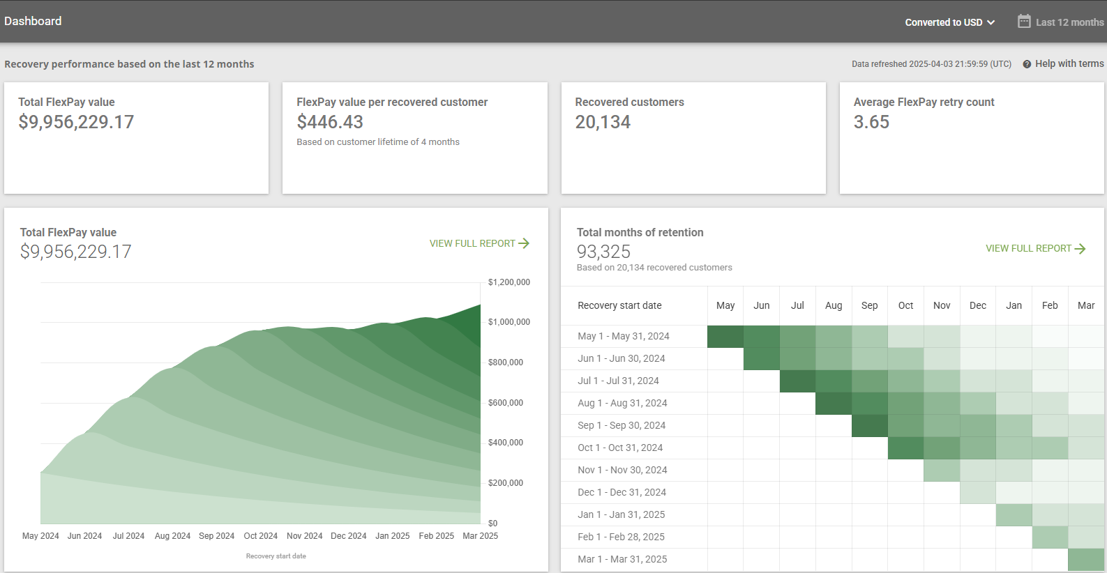
When you log into the FlexPay Client Portal, the Dashboard is the first screen you’ll see. It provides key metrics that highlight the impact of FlexPay on your business.
The dashboard is designed to help you quickly understand how FlexPay contributes to revenue retention and customer recovery. It connects your failed payment performance with long-term business outcomes like customer lifetime value and retained revenue.
By default, the dashboard displays data from the last 12 months and converts all values to USD. If you need to view metrics for a specific currency or company, use the dropdown options in the top right corner.

Key Dashboard Indicators
At a glance, the dashboard presents four key indicators:
Total FlexPay value
The total estimated revenue retained through successful failed payment recovery represents the value of keeping customers active. This metric captures the cumulative impact of recovery: not just the recovered transaction, but the customer relationship saved.
Formula
Total FlexPay Value = Recovered Customers × Average FlexPay Value per Customer
Interpreting the data:
This calculation quantifies the full impact FlexPay has on your revenue. Rather than focusing solely on recovered payments, it quantifies the future revenue that would have been lost had the customer churned. This metric reflects both operational success and long-term strategic value. It serves as a primary benchmark for assessing the ROI of your recovery strategy.
FlexPay value per recovered customer
The average revenue retained per customer recovered through FlexPay is based on the value of the recovered transaction and the expected lifetime of that customer.
Formula
FlexPay Value per Recovered Customer = Average Order Value x Customer Lifetime
Interpreting the data:
This metric shifts the focus from the short-term win of a recovered payment to the broader economic gain of keeping a customer engaged. It reflects the Customer Lifetime Value (CLTV) of recovered customers and shows how a single recovery today can translate into months or years of future revenue. Use this to understand how valuable your recoveries are, and to prove that investment in failed payment recovery is a growth strategy.
Recovered customers:
The total number of customers whose failed payments were successfully recovered.
Interpreting the data:
This is the core driver of revenue retention. Every recovered customer represents a relationship saved and a churn event avoided. Monitoring this number helps you assess how effective FlexPay is at preserving your subscriber base. When this number rises, so does your future revenue stability.
Average FlexPay retry count:
The average number of retry attempts FlexPay makes at the payment gateway.
Interpreting the data:
This metric offers insight into how efficiently FlexPay recovers payments. A lower retry count suggests faster recovery and reduced customer friction. Since retries are a finite resource, using them intelligently contributes to more sustainable recovery performance and a healthier merchant account.
Two significant values have a major impact on these metrics:
- Average Order Value (AOV): The average revenue generated per transaction. This is calculated by dividing the total revenue by the number of orders within a given period. A higher AOV means each recovered customer contributes more revenue per transaction, increasing the overall impact of FlexPay. The AOV is calculated automatically using your transaction data, ensuring accuracy without requiring manual input.
- Customer Lifetime: The average duration a customer continues to generate revenue before churning. This is measured in months and helps estimate the total value a customer brings to the business. A longer customer lifetime increases the long-term revenue impact of recovered customers, as they continue to make repeat purchases or renew subscriptions.
Total FlexPay Value Chart
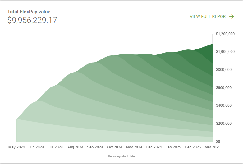
Beneath the top-line metrics, the dashboard displays a 12-month time series chart of your Total FlexPay Value. This area chart combines actual recovered revenue with projected lifetime value, modeling how each recovery cohort continues to generate revenue over time. By visualizing both immediate and long-term contributions, the chart helps you evaluate performance trends, identify seasonal patterns, and understand the strategic impact of FlexPay on customer retention and revenue stability.

What it shows:
- Monthly Recovery Cohorts: Each data point on the chart corresponds to a cohort of recovered customers in a specific month. The value for each month reflects the actual revenue recovered at the time of recovery.
- Projected Future Value: The chart also distributes the projected lifetime value of each recovered cohort across subsequent months, based on a modeled natural distribution. While the total value per cohort is a simple calculation of Customer Lifetime times AOV, the shape of the curve represents an estimated allocation of that value over time to simulate the probability of customers churning in a given month.
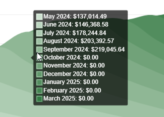
When you hover over a specific month in the chart, a tooltip shows a detailed breakdown of the value attributed to each recovery cohort for that selected month.

- The value shown next to the hovered month (e.g., September 2024: $219,045.64) represents the actual recovered revenue for that cohort during that recovery period.
- The values shown for previous months (e.g., April through August) represent the ongoing projected value from customers who were recovered in those earlier periods and are still generating revenue in the hovered month.
Clicking View Full Report takes you to the full Total FlexPay Value report, which expands on the chart by including a detailed monthly breakdown table that shows how each recovery cohort contributes value over time.
Total Months of Retention Chart
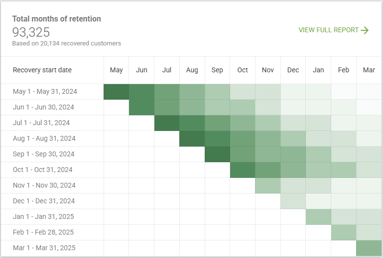
To the right of the Total FlexPay Value chart, the dashboard includes a second visualization highlighting the number of customers' rebills after recovery. This view helps you understand the long-term impact of FlexPay’s performance by showing how retained customers are rebilled over time.
The data combines both observed and modeled behavior. The number of rebilled customers in the recovery month reflects actual recoveries, while subsequent months represent estimated retention based on lifetime value modeling.

What it shows:
- Heatmap Grid: Each row represents a recovery cohort (e.g., customers recovered in May 2024), and each column corresponds to a calendar month following recovery. The intensity of the color is a visual aid to highlight the highest amount of rebills in deep green and the lowest in light green.
- Top-Level Metric: Displayed above the chart, this value reflects the total number of customer rebills across all cohorts within the year to date.
When you hover over a specific cell in the chart, a tooltip shows the number of customers rebilled from a retained cohort from a specific calendar month.
- The value shown when hovering over the recovery month (e.g., May 2024 for the May 1 – May 31, 2024 cohort) shows the actual number of customers recovered during that period, based on observed data.

- The values shown for subsequent months (e.g., July 2024 for the May cohort) are the estimated number of customers from that original recovery group still being rebilled in that month. These values are modeled using customer lifetime.

Clicking View Full Report opens the full Recovered Customer Retention report, where you can explore each cohort in more detail.
Important
The charts only include cohorts whose recovery started within the last 12 months. Any projected value from earlier cohorts is excluded.
The projected value is only displayed up to the current calendar month. Any value expected beyond the current month is not shown in the charts
Updated 6 months ago
